My biggest weak spot when designing an album - detail shots! I just can't say no to those amazing flower close-ups, getting ready accessories, reception details, and of course, ring shots! I know from planning my own wedding, SO much time goes into arranging the "little things." Why wouldn't you want all that hard work featured in your album!?
Details shots are perfect for the opening pages of the the album. They quickly convey the color scheme and mood of the wedding. Check out all the pretty pink in this spread:
I love the bold blue in this one, and how the main image captures the intricacy of the dress hem. There are so many great "getting ready" details - the bouquets, the shoes, the dress, the hair, the make-up...the list goes on and on!
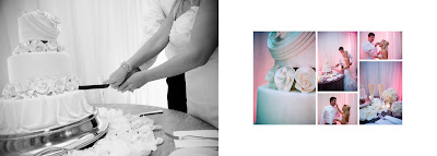
Set the scene for the reception section of the album with some more great detail shots. Here's the spread from my own winter wedding:
Sometimes I like to put a bunch of detail shots on one page to capture how well everything fits together...
And sometimes I like to feature just a few shots to make a strong and elegant statement.
It's easy to pick the formals and action shots for the album, but don't forget those all-important detail images! These pictures are what really tell the story of that unforgettable day.

Showing posts with label image selection. Show all posts
Showing posts with label image selection. Show all posts
Tuesday, May 19, 2009


Saturday, April 18, 2009
Image Selection: How Many Images
One question I am frequently asked is: "How many images should I send/choose for my album?" The first and easiest answer, of course, is that it depends on the number of pages. (Quick definition check...the terminology in the album world can be super confusing, because many people define the same words differently. To keep my head straight, I distinguish a "page" as one side of a layout...similar to how a book's pages are numbered. When referring to the two sides together, I use the terms "layout" or "spread.")
To give people an idea of how many images will be included in their end product, I use the guideline of 2-3 images per page (which is 4-6 images per layout). Why the range? When I plan an album, I like to think of the overall balance...not just the balance of a spread, but the connection between all the layouts in the book. To have a real "page turner", you want to keep the viewer involved with interesting and varying designs. This mean having some full spreads, as well as some simple, clean spreads. The more basic spreads have two main purposes: 1) they allow a couple of stunning images to really make an impact, 2) they give the eye a rest, a stopping place to re-orient. I'm never one to lean towards chaotic or busy designs, but when I do a spread that showcases many images, I like to "restore the peace" with a really classic design that has just a few strong images. It's incredible how much impact images can have when they are designed in the simplest way.
Here's a couple spreads to show the value of album variety. This first spread isn't "busy", but it is full. There is a faded image on the right side, as well as an overlapping white bar with smaller images. The balance of the spread is maintained by the larger detail shot on the left side, and the similar color palette across the images.
On the next spread, I wanted to add in some white space and just showcase two images (and one GREAT flower detail shot). The lovely bride and groom with a burst of green...
 Here's an example of a simple page that really captures the emotion of the images. The large image on the left and the abundance of white space on the right allow the eye to really absorb what's going on. Don't you just want to CELEBRATE?

Finally, a spread with edge to edge images. Still simple, but with a little more to take in. The single sepia image balances the spread and give your eyes a starting point.

To give people an idea of how many images will be included in their end product, I use the guideline of 2-3 images per page (which is 4-6 images per layout). Why the range? When I plan an album, I like to think of the overall balance...not just the balance of a spread, but the connection between all the layouts in the book. To have a real "page turner", you want to keep the viewer involved with interesting and varying designs. This mean having some full spreads, as well as some simple, clean spreads. The more basic spreads have two main purposes: 1) they allow a couple of stunning images to really make an impact, 2) they give the eye a rest, a stopping place to re-orient. I'm never one to lean towards chaotic or busy designs, but when I do a spread that showcases many images, I like to "restore the peace" with a really classic design that has just a few strong images. It's incredible how much impact images can have when they are designed in the simplest way.
Here's a couple spreads to show the value of album variety. This first spread isn't "busy", but it is full. There is a faded image on the right side, as well as an overlapping white bar with smaller images. The balance of the spread is maintained by the larger detail shot on the left side, and the similar color palette across the images.

On the next spread, I wanted to add in some white space and just showcase two images (and one GREAT flower detail shot). The lovely bride and groom with a burst of green...
 Here's an example of a simple page that really captures the emotion of the images. The large image on the left and the abundance of white space on the right allow the eye to really absorb what's going on. Don't you just want to CELEBRATE?
Finally, a spread with edge to edge images. Still simple, but with a little more to take in. The single sepia image balances the spread and give your eyes a starting point.

Since you can't predict how the images will fit together in the end, it's better to send too many pictures than too few. The guideline of "2-3 images per page" isn't really a design mandate (you can see that two of the spreads above only have 1 image per page), but rather an alternative way to think of album layout. Instead of forcing images into pre-designed spreads, why not let the images lead the way! Group high-energy images (getting ready, reception dancing, etc.) into clean, but action-filled pages. And let those powerful "wow" shots have their own space. The end result - an interesting and stunning album that is specifically designed for YOUR images!
Wednesday, April 15, 2009
Image Selection: Direction and Freedom
Image selection for an album can be overwhelming. I remember the day after my wedding, I was itching to get my hands on the photographer's pictures. When I finally got the proofs, I was so enamored with seeing myself in a big, puffy dress that I loved every single shot! Truly, all 727 of them. The first wedding album I designed for myself was 64 pages...after I cut back! One of the great things about the switch to digital photography is that brides are getting more images of their special day. But how do you choose which to put in your album?
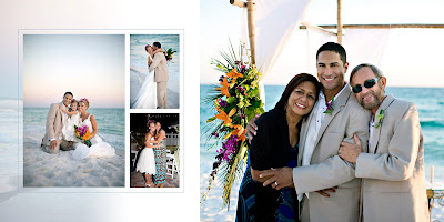
Several people can be a part of the picture selection process. Some brides want to choose all their pictures; sometimes the photographer selects all the images. My ideal designing situation is to get the CD of all acceptable images (the ones you'd be happy to have in your album) and also a list of the bride's and/or photographer's must have images. This combination of direction and freedom is a designer's dream come true. The list of your absolute favorites reduces the amount of revisions and image swapping down the road. And the range of other images allows the designer to put together a variety of shots that complement each other. Some close ups, some landscapes. Some people shots, some details. Colors and photo treatments that coordinate and make the entire layout look like it just fits.
Here are some examples of what designer freedom can produce:
The beauty in the above layout comes from the similar lighting and color tones. Let's say the bride didn't send two of these pictures, so I had to use ones that weren't taken at this time of day or on the beach. The effect is lost when a couple of images are swapped.
Here's another example of a beautiful complimentary layout. In this spread, the soft pink hue is repeated on the right side, which really allows the black and white image on the left to make a statement.
 photography by Brooke Schwab
Several people can be a part of the picture selection process. Some brides want to choose all their pictures; sometimes the photographer selects all the images. My ideal designing situation is to get the CD of all acceptable images (the ones you'd be happy to have in your album) and also a list of the bride's and/or photographer's must have images. This combination of direction and freedom is a designer's dream come true. The list of your absolute favorites reduces the amount of revisions and image swapping down the road. And the range of other images allows the designer to put together a variety of shots that complement each other. Some close ups, some landscapes. Some people shots, some details. Colors and photo treatments that coordinate and make the entire layout look like it just fits.
Here are some examples of what designer freedom can produce:

The beauty in the above layout comes from the similar lighting and color tones. Let's say the bride didn't send two of these pictures, so I had to use ones that weren't taken at this time of day or on the beach. The effect is lost when a couple of images are swapped.

Here's another example of a beautiful complimentary layout. In this spread, the soft pink hue is repeated on the right side, which really allows the black and white image on the left to make a statement.
 photography by Brooke Schwab
I love the challenge of mixing and matching images to get the perfect look for each spread. Visually appealing layouts are what make the story come alive! So when selecting your album images, you definitely want your favorites in there...but don't be afraid to leave the rest up to the designer. Sit back and enjoy some well-deserved relaxation. You may be amazed at what a little creative freedom can produce!
Subscribe to:
Posts (Atom)