Several people can be a part of the picture selection process. Some brides want to choose all their pictures; sometimes the photographer selects all the images. My ideal designing situation is to get the CD of all acceptable images (the ones you'd be happy to have in your album) and also a list of the bride's and/or photographer's must have images. This combination of direction and freedom is a designer's dream come true. The list of your absolute favorites reduces the amount of revisions and image swapping down the road. And the range of other images allows the designer to put together a variety of shots that complement each other. Some close ups, some landscapes. Some people shots, some details. Colors and photo treatments that coordinate and make the entire layout look like it just fits.
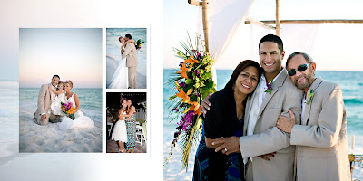
Here are some examples of what designer freedom can produce:
The beauty in the above layout comes from the similar lighting and color tones. Let's say the bride didn't send two of these pictures, so I had to use ones that weren't taken at this time of day or on the beach. The effect is lost when a couple of images are swapped.

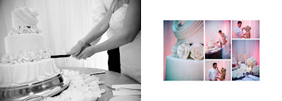
Here's another example of a beautiful complimentary layout. In this spread, the soft pink hue is repeated on the right side, which really allows the black and white image on the left to make a statement.
 photography by Brooke Schwab
I love the challenge of mixing and matching images to get the perfect look for each spread. Visually appealing layouts are what make the story come alive! So when selecting your album images, you definitely want your favorites in there...but don't be afraid to leave the rest up to the designer. Sit back and enjoy some well-deserved relaxation. You may be amazed at what a little creative freedom can produce!


I wish KruBooks existed when I got married! I still have a stack of photos that I don't know what to do with. You're right, it is so overwhelming to select the images and when i finally just made a decision, I ended up with a bunch of photos with no idea how to arrange them! I love what you do!!
ReplyDeleteOh my goodness, Katie! I love your ideas. You are so creative and talented. I can't wait until tomorrow's post!
ReplyDeleteWell said, Katie! And I love the beach layout ... so pretty!
ReplyDeleteWoo hoo! I LOVE blogs! :)
ReplyDeleteOh, Katie, I'm with Lorren!! I want my photos put in a Krubook!! You are so talented!! And the way you explained what you do and the effects you are desiring were clear and concise and tempting!! Every bride to be and bride should be introduced to your blog and Krubooks!!
ReplyDelete